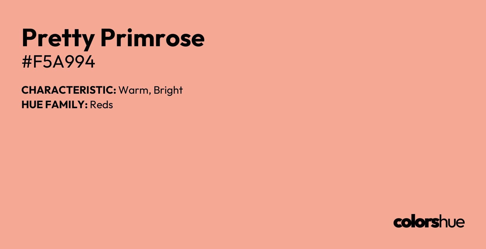
Pretty Primrose Color (#f5a994): Meaning, HEX code, RGB, Shades, Tones, Wallpaper

Analogous Palette
Related Colors
Download Palette
Hue Family:
red
red Family:
light-vibrant
Saturation:
moderately saturated
Tones:
colorful tone
Shade:
light
Temperature:
warm
Chromaticity:
chromatic
Chroma:
medium chroma
What is the Meaning and Symbolism of the Pretty Primrose Color?
The hex color #f5a994, named Pretty Primrose, bears resemblance to various natural elements and common objects. Its warm, delicate shade is reminiscent of the sunset glow, resembling the soft hues that paint the sky during twilight. This color also evokes the image of blooming flowers, particularly primroses, with their pale pink and peach tones. Additionally, Pretty Primrose resembles the flesh of a juicy, ripe apricot, exuding a sense of freshness and sweetness. Other objects that share this color include seashells, sand dunes, and the delicate petals of coral-colored roses.
What is the HEX Code and RGB Value for the Pretty Primrose Color?
The Pretty Primrose color is represented by the HEX code #f5a994, and its RGB equivalent is RGB(245, 169, 148). These values are widely used in web design and digital media to ensure accurate color representation across different platforms.
How Is the Pretty Primrose Color Represented in Various Color Models?
The Pretty Primrose color can be represented using various color models, such as HSL, HSV, and CIELAB, each offering different perspectives on the color's characteristics.
| Model | Values |
|---|---|
| RGB | RGB(245, 169, 148) |
| HSL | 13, 83, 77 |
| LAB | 76, 25, 22 |
| XYZ | 57, 50, 35 |
| CMYK | 0, 0, 0, 0 |
How is the Pretty Primrose color represented in CMYK?
For print purposes, the Pretty Primrose color's CMYK code is 0%, 0%, 0%, 0%. This conversion ensures consistency in printing where subtractive color models are necessary.
How is Pretty Primrose color described in the HSL model?
In the HSL (Hue, Saturation, Lightness) model, Pretty Primrose is represented by a hue of 13°, saturation of 83%, and lightness of 77%. This model is primarily used in graphic design software to modify the lightness or color richness, helping designers achieve the perfect balance of brightness and intensity for their projects.
How does Pretty Primrose behave in the HSV model?
In the HSV model, Pretty Primrose color is represented by hue 13°, saturation 40%, and value 96%.
What is the CIELAB Representation of Pretty Primrose?
The CIELAB model represents Pretty Primrose as *L = 76, *a = 25, and *b = 22**. This model is used in color science to approximate how the human eye perceives color.
How is Pretty Primrose Color Represented in the XYZ Model?
In the XYZ color model, Pretty Primrose is represented by X = 57, Y = 50, and Z = 35. This model is foundational for understanding how colors are mapped in 3D space.
How is Pretty Primrose Represented in the YUV Model?
The YUV model represents Pretty Primrose by Y = 189 (luminance), U = -20, and V = 49 (chrominance). This model is mainly used in video broadcasting and image compression.
What is the Decimal Value of the Pretty Primrose Color?
The decimal value of Pretty Primrose is 16099732. This numerical value is often used in programming and digital systems for color identification.
What is the Web-Safe Version of the Pretty Primrose Color?
The web-safe version of Pretty Primrose is #5f9ea0. Web-safe colors ensure compatibility across older browsers and systems.
What is the Color Temperature of Pretty Primrose?
The color temperature of Pretty Primrose is 3205.1914856196204 Kelvin (K). This is particularly relevant for lighting design and photography, where the warmth or coolness of light sources is measured.
What is the Estimated Wavelength of Pretty Primrose?
The wavelength of Pretty Primrose is approximately 643.51nm. The wavelength corresponds to the light reflected by the color, crucial in fields like optics and light engineering.
What Shades and Tones Are Available for Pretty Primrose Color?
The Pretty Primrose color offers a variety of shades and tones. Common shades include:
- Light Pretty Primrose: A softer, pastel version commonly used in interior design and minimalist themes
- Dark Pretty Primrose: A more intense tone, ideal for accent pieces and creating contrast
What are the tints of Pretty Primrose color?
The tings of the color Pretty Primrose are:
-
#F5A994
RGB(245, 169, 148) HSL(13, 83%, 77%)
-
#DD9885
RGB(221, 152, 133) HSL(13, 56%, 69%)
-
#C48776
RGB(196, 135, 118) HSL(13, 40%, 62%)
-
#AC7668
RGB(172, 118, 104) HSL(12, 29%, 54%)
-
#936559
RGB(147, 101, 89) HSL(12, 25%, 46%)
-
#7B554A
RGB(123, 85, 74) HSL(13, 25%, 39%)
-
#62443B
RGB(98, 68, 59) HSL(14, 25%, 31%)
-
#4A332C
RGB(74, 51, 44) HSL(14, 25%, 23%)
-
#31221E
RGB(49, 34, 30) HSL(13, 24%, 15%)
-
#18110F
RGB(24, 17, 15) HSL(13, 23%, 8%)
What are the shades of Pretty Primrose color?
The shades of the color Pretty Primrose are:
-
#F5A994
RGB(245, 169, 148) HSL(13, 83%, 77%)
-
#F6B29F
RGB(246, 178, 159) HSL(13, 83%, 79%)
-
#F7BAA9
RGB(247, 186, 169) HSL(13, 83%, 82%)
-
#F8C3B4
RGB(248, 195, 180) HSL(13, 83%, 84%)
-
#F9CBBF
RGB(249, 203, 191) HSL(12, 83%, 86%)
-
#FAD4CA
RGB(250, 212, 202) HSL(13, 83%, 89%)
-
#FBDDD4
RGB(251, 221, 212) HSL(14, 83%, 91%)
-
#FCE5DF
RGB(252, 229, 223) HSL(12, 83%, 93%)
-
#FDEEEA
RGB(253, 238, 234) HSL(13, 83%, 95%)
-
#FEF6F4
RGB(254, 246, 244) HSL(12, 83%, 98%)
What is the difference between shades and tones of Pretty Primrose?
Shades of Pretty Primrose are created by adding black to the base color, resulting in a darker appearance, whereas tones are achieved by adding gray, making the color more muted.
How can Pretty Primrose color gradients be created?
Pretty Primrose color gradients are popular in digital design. Gradients often start with light Pretty Primrose and transition to darker tones, adding depth to websites and mobile applications.
Where can you download Pretty Primrose color wallpapers for various devices?
Pretty Primrose wallpapers are available for:
- 4K and 5K displays: Pretty Primrose color wallpapers bring depth and richness to high-resolution desktop screens.
- iPhone screens: Optimized for iPhone 13 Pro Max, iPhone 12, and other models with screen resolutions like 1170 x 2532 pixels.
- Android devices: Available in resolutions like 1080 x 2400 pixels for Samsung Galaxy S21 and others.

Pretty Primrose Color Wallpapers for Download
Download free Pretty Primrose (#f5a994) color wallpapers for all your devices. Our collection includes high-resolution 4K (3840x2160) and 5K (5120x2880) desktop wallpapers, as well as mobile-optimized versions for iPhone (1170x2532) and Android (1440x2560) devices. Each wallpaper features the stunning Pretty Primrose color, perfect for minimalist and modern device customization. These professionally designed solid color wallpapers are free to download and use as your background or lock screen.